
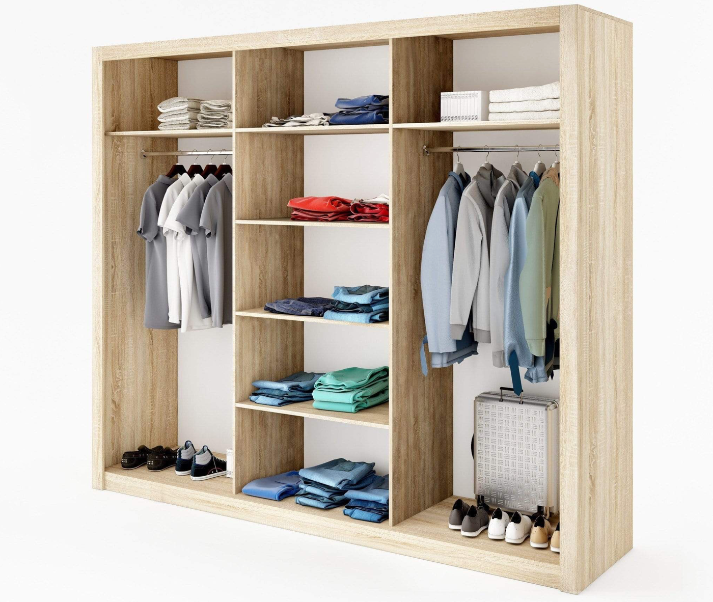
Dressing “smart” isn’t just about suiting up so that you can walk around a room with flair and authority – oh no! With our busy lifestyles, dressing smart has more to do with wardrobes that are simple but loaded with variety. It’s about making the “less is more” approach really work for you.
How do you do this? One solution is to choose a colour palette for your wardrobe, and then stick to it. Creating a coherent wardrobe starts with the traditional theory of mixing and matching, and a colour palette helps to simplify this process.
What is a colour palette?
A colour palette refers to a collection of different colours that can be matched together to create feelings of harmony. These colours complement and enhance each other so that they are appealing to the eye when combined.
Why is a colour palette for your wardrobe important?
We are all unique and because of this, our colour preferences are going to differ vastly. The good news, in this regard, is that there are no set rules about what your colour palette should be. What is important is that you are aware of how you look and feel when you are wearing certain hues, and if the colours have integrated strategically. This will help you to establish a wardrobe that evolves towards more and more outfit options and will ultimately eliminate buyer’s remorse.
How to Choose the Best Colour Palette for Your Wardrobe
To create a smart wardrobe that includes clothes you love to wear, it’s useful to understand colours, starting with the distinction between base and highlight colours.
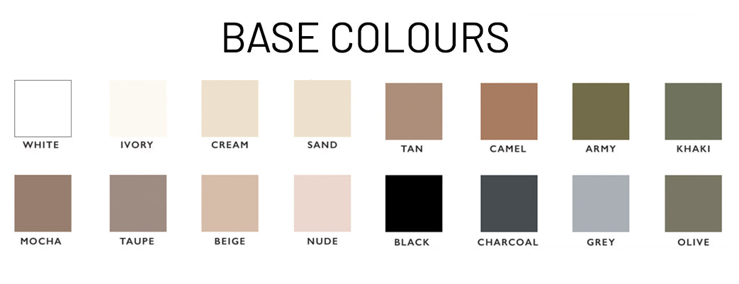
Base Colours
Base colours are typically the neutral tones that you wear most frequently, such as black, white, beige, grey, and navy. However, if red or pink or purple, etc. is your colour and forms part of your personality, then these brighter and bolder hues can also be considered as base colours.
Base colours are what transcend seasons and are shades that you will never tire of over the years. They can be chosen according to your preferences … and this is where you determine what your preferences are, exactly. For example, if navy just doesn’t work with your skin tone, then ditch it.
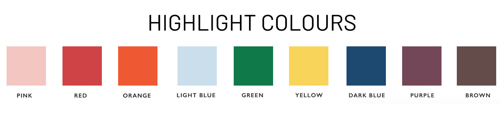
Highlight Colours
While base colours are needed to create the “base” of your wardrobe, no one should be held hostage by these plain tones only. Many of us enjoy wearing brighter shades or items of clothing with interesting patterns, prints, and designs – and this is where highlight colours come into play.
Highlight colours help to keep your wardrobe seasonal and trendy. These are the colours you can choose when you feel like doing a bit of impulsive shopping and can easily be mixed and matched with your assortment of base-toned garments.
Experimenting with Colours
Once you’ve given some thought to the base colours you prefer and which highlight colours enhance your appearance and your mood, then it’s time to play around with putting them together.
Now, there’s no hard or fast rule about how you should combine base tones and highlights so you will have to take some time to experiment with colour combinations to see which ones click and which ones give you that awkward feeling of being out of place.
To make your exploration easier with a touch of direction, you can use the formulas below as guidelines:
Colour Blocking
Colour blocking involves keeping one solid (or main) colour to each piece of clothing. The colour combinations should not exceed two colours in the whole outfit (excluding neutral tones).
This foolproof formula is a great “rule of thumb” that can be applied when you’re in a rush or want to play your outfit safe.
Tip: Facilitate block-colour dressing by selecting coloured pants, silk shirts, summer tops and other smaller garments that can easily be paired with neutral basics such as jeans or a leather jacket.
Tonal Dressing
Tonal dressing is ideal for personalities who aren’t too keen on mixing colours but still want to add variation to their outfits. It involves selecting a single colour and then wearing items that are different shades of that colour in a single outfit.
To achieve this look, you’ll need lots of different shades of the same colour in your wardrobe.
For example:
- Black, grey, white
- Brown, beige, cream
- Dark blue, blue, light blue
Create greater or less contrast, the choice is up to you and what your luxury wardrobe has to offer.
Tip: accessories tonal outfits with hints of black and white to add interesting contrast.
Print Matching
Printed clothes are sometimes a little trickier to pair with other garments, especially if you do not have a lot of base-toned items to work with. A simple technique is to pick out one or two main colours of your print and then match them with other clothing items. For example, a patterned top with beige and blue elements can be paired with beige pants, even if the pants are a lighter or darker shade of beige.
The idea is to use the printed garment as the focal point of your outfit by complementing it with one other solid colour.
These formulas are here to give you direction so that getting dressed every day can be less overwhelming and more satisfying. Naturally, there will always be a million exceptions to the rule but having a foundation to work with will help you feel more confident when you sway from the guidelines to put together a stylish outfit that’s creatively you.